Logo
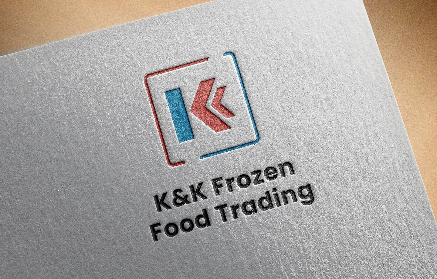
K&K Frozen Food Trading Logo
A clean, geometric logo for a frozen food distributor and dealer of trusted brands like Mekeni, Purefoods, and imported meats.
Year :
2022
Industry :
Food Distribution / Frozen Goods
Client :
K&K Frozen Food Trading
Project Duration :
4 days
Problem :
K&K Frozen Food Trading is a distributor and dealer for major food brands like Mekeni, Purefoods, and a range of imported meats. Because they work with such well-known names, they needed a logo that looked established and trustworthy. Their brand had to hold its own next to the big labels they carry.
Solution :
I took a geometric approach and combined two “K” letters into one unified mark.
Unified Monogram: The two K’s connect into a single shape that stands for partnership and smooth distribution.
Trustworthy Look: Solid, balanced forms make the business feel reliable and professional.
Easy to Recognize: A simple mark that stays clear on delivery vans, packaging, signage, and social media.
Challenge :
The main challenge was helping K&K stand out as a reliable distributor without making the design complicated. The logo had to be memorable on its own while still looking at home next to the major brands they supply.
Summary :
The final logo gives K&K Frozen Food Trading a strong and credible identity. The connected K monogram reflects partnership and dependable service, which helps the business earn trust with both suppliers and customers.
Tools: Adobe Illustrator, Adobe Photoshop, Canva
Deliverables: Logo Design, Monogram Mark, Brand Identity
Facebook Page: https://www.facebook.com/kkfrozenfoodtrading/
More Projects


Logo
K&K Frozen Food Trading Logo
A clean, geometric logo for a frozen food distributor and dealer of trusted brands like Mekeni, Purefoods, and imported meats.
Year :
2022
Industry :
Food Distribution / Frozen Goods
Client :
K&K Frozen Food Trading
Project Duration :
4 days
Problem :
K&K Frozen Food Trading is a distributor and dealer for major food brands like Mekeni, Purefoods, and a range of imported meats. Because they work with such well-known names, they needed a logo that looked established and trustworthy. Their brand had to hold its own next to the big labels they carry.
Solution :
I took a geometric approach and combined two “K” letters into one unified mark.
Unified Monogram: The two K’s connect into a single shape that stands for partnership and smooth distribution.
Trustworthy Look: Solid, balanced forms make the business feel reliable and professional.
Easy to Recognize: A simple mark that stays clear on delivery vans, packaging, signage, and social media.
Challenge :
The main challenge was helping K&K stand out as a reliable distributor without making the design complicated. The logo had to be memorable on its own while still looking at home next to the major brands they supply.
Summary :
The final logo gives K&K Frozen Food Trading a strong and credible identity. The connected K monogram reflects partnership and dependable service, which helps the business earn trust with both suppliers and customers.
Tools: Adobe Illustrator, Adobe Photoshop, Canva
Deliverables: Logo Design, Monogram Mark, Brand Identity
Facebook Page: https://www.facebook.com/kkfrozenfoodtrading/
More Projects
Logo
K&K Frozen Food Trading Logo
A clean, geometric logo for a frozen food distributor and dealer of trusted brands like Mekeni, Purefoods, and imported meats.
Year :
2022
Industry :
Food Distribution / Frozen Goods
Client :
K&K Frozen Food Trading
Project Duration :
4 days
Problem :
K&K Frozen Food Trading is a distributor and dealer for major food brands like Mekeni, Purefoods, and a range of imported meats. Because they work with such well-known names, they needed a logo that looked established and trustworthy. Their brand had to hold its own next to the big labels they carry.
Solution :
I took a geometric approach and combined two “K” letters into one unified mark.
Unified Monogram: The two K’s connect into a single shape that stands for partnership and smooth distribution.
Trustworthy Look: Solid, balanced forms make the business feel reliable and professional.
Easy to Recognize: A simple mark that stays clear on delivery vans, packaging, signage, and social media.
Challenge :
The main challenge was helping K&K stand out as a reliable distributor without making the design complicated. The logo had to be memorable on its own while still looking at home next to the major brands they supply.
Summary :
The final logo gives K&K Frozen Food Trading a strong and credible identity. The connected K monogram reflects partnership and dependable service, which helps the business earn trust with both suppliers and customers.
Tools: Adobe Illustrator, Adobe Photoshop, Canva
Deliverables: Logo Design, Monogram Mark, Brand Identity
Facebook Page: https://www.facebook.com/kkfrozenfoodtrading/